
Using Radio Button Groups
A radio button group is placed on the Diagram window using the Add Radio Group button on the Diagram Window Toolbar (Professional license). A radio button group provides up to 8 radio buttons. Each button is associated with a set of EES commands that are enabled when the corresponding radio button is selected. The following dialog window will appear after clicking the toolbar button.
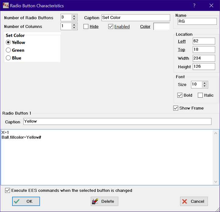
The number of radio buttons is set with the spin control, or by entering the value. The number of buttons can be between 2 and 8. The number of columns controls how the buttons are positioned. The number of columns can be between 1 and 4. An optional group caption can be entered for the radio button group. The width, height, location, font characteristics and background color can also be specified.
If the Enabled check box is unchecked, the radio button group will be disabled, i.e., a different button selection will not be possible in Application mode.
Checking the Show Frame option will result in a gray frame around the button group while in application mode. Changing any of these controls will cause radio button group shown in the dialog to be redrawn as it will appear in the Diagram window.
The radio group can be given a name. If a name is provided, the characteristics identified with underlined text, e.g., left, top, fontcolor, color, enabled, and hide, can be set with EES variables. In the example above in which the name is RG, setting EES variable RG.left=100 in the Equations window or in a Diagram window control will change the left edge of the radio button group to 100 pixels from the left edge of the Diagram window.
Each button is associated with EES commands. The caption and EES commands for the currently selected button appear at the bottom of the dialog. Both the caption and the EES commands for this button can be modified.
If "Execute EES commands when check status is changed" is selected, EES will attempt to execute the commands associated with the selected button directly after it is selected. This capability is most useful when the check box setting affects the display in the Diagram window in some way. The frivolous example above sets the fill color of another object named ball to yellow. A more useful application of the radio button capability would be to control the position and visibility of objects, text, and buttons on the Diagram window. For example, a Calculate button can be hidden by setting the EES variable, Name.Hide=true# where Name is the name give to the Calculate button in the Calculate Button Characteristics dialog.
After clicking the OK button the radio button group will appear in the Diagram window. In Development mode, the radio button group can be dragged to a new position by pressing and holding the mouse on the group border will moving the group to a new location. Alternatively, the radio group can be moved using the arrow keys. Holding the arrow key down more than 3 seconds causes the speed at which the control is moved to increase. If the mouse is pressed on the lower right corner of the radio button group border the cursor will change to a resize arrow cursor. Dragging the mouse or pressing the arrow keys at this point will allow the width and height to be changed. Right-clicking (or double-clicking the left mouse button) on the group border in Development mode brings up the Radio Button Characteristics dialog so changes can be made. Alternatively, the Radio Button Characteristics dialog can be made to appear by selecting the radio group (by clicking anywhere on or within the border) and then clicking the Radio Group button in the Diagram Window toolbar.
See also: Using Check Boxes